What I like and dislike about Ubuntu 17.10
The release of Ubuntu 17.10 marks (yet another) paradigm shift in the development history of this Linux distribution. The home-grown Unity desktop shell is gone; Ubuntu 17.10 offers a Ubuntu-flavored Gnome desktop experience. This article lists my impressions with Ubuntu 17.10. It’s really mostly negative impressions, but some things are better than with Ubuntu 17.04. May it help others make the decision whether to upgrade to 17.10 or not.
This post will probably be updated over time.
Screenshots
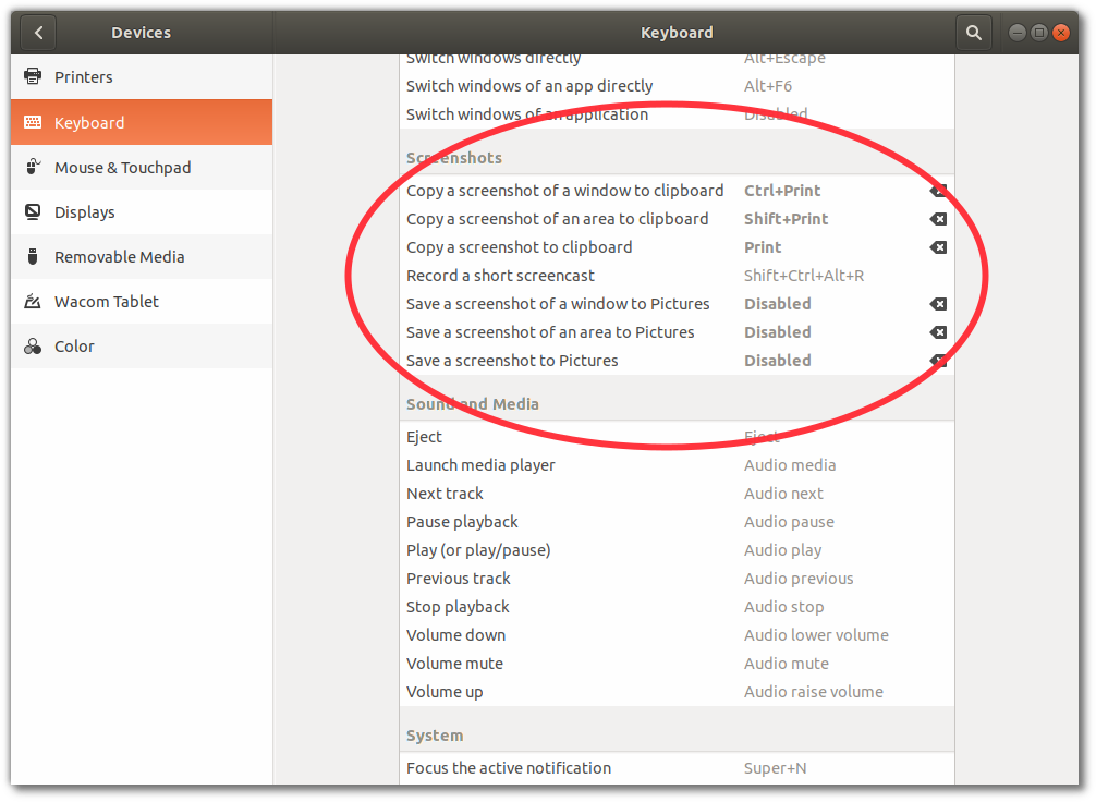
- Shutter does not work with Ubuntu 17.10, which uses the new Wayland display server instead of the old X.org server. Gnome-screenshot, which comes with Gnome, is rather clumsy. Or I’m too clumsy for gnome-screenshot. I take a lot of screenshots. You can of course take screenshots and have them copied to the clipboard with keyboard shortcuts (see screenshot ;-) below), but it’s not the same as with Shutter.

Nautilus (Files)
- Lack of type-ahead search. Ubuntu used to have a patched version of Nautilus that added this feature, but the version included in Ubuntu 17.10 is not patched.
Windows
- Modal dialogs are attached to the parent window and cannot be moved. What a nuisance! When I save a PDF file of a scientific article, I often have to move the file dialog out of the way to see the article’s first author’s name. Impossible with the default setting. Luckily, this behavior can be changed with the Tweak tool.
- Ubuntu used to be very efficient with screen real estate. Ubuntu 17.10 (Gnome desktop) takes away vertical space with a window title bar that used to integrate nicely with the desktop title bar.
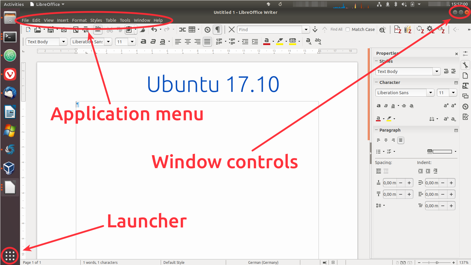
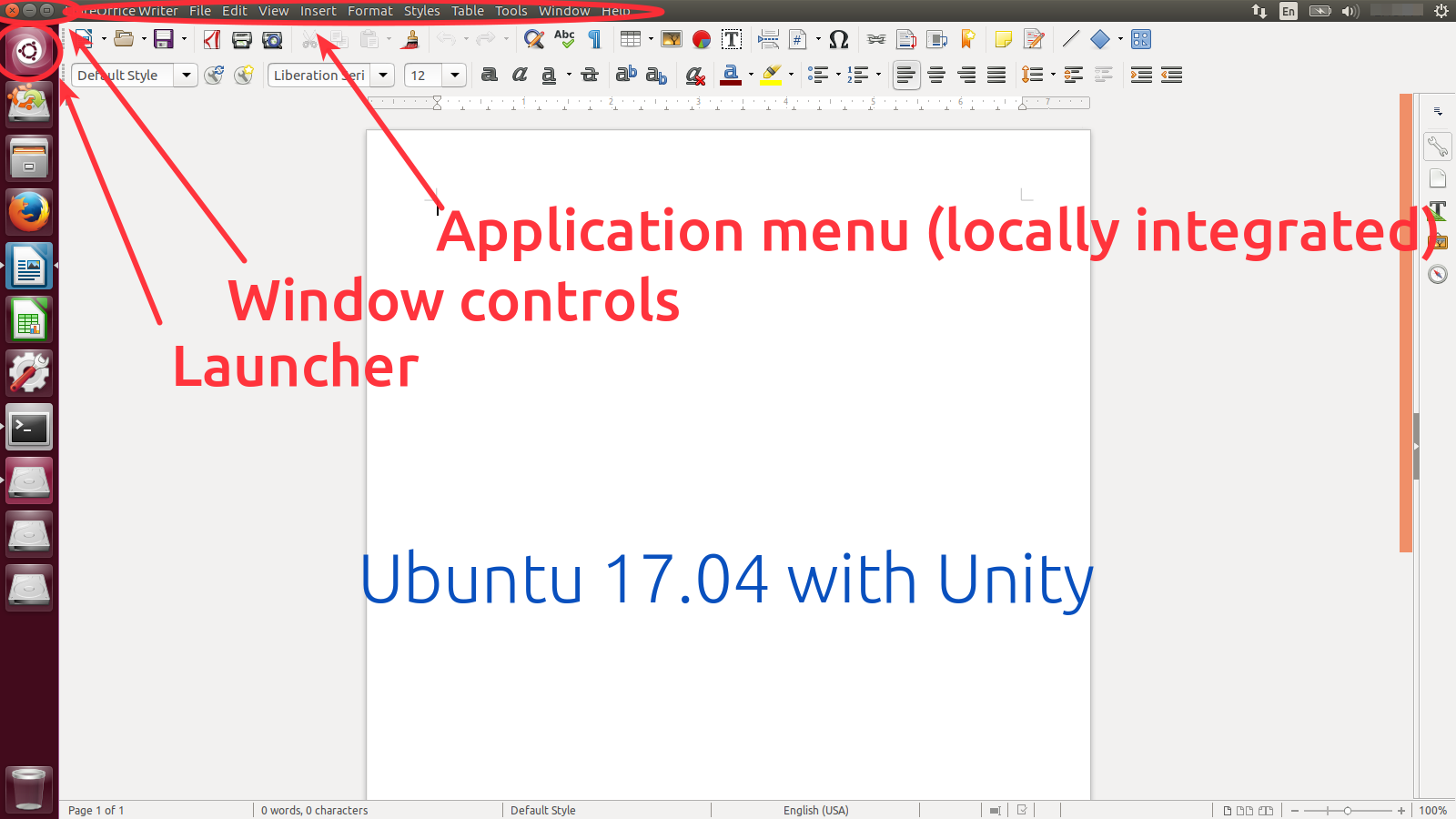
- Buttons are all over the place. The application menu is invoked from a button in the bottom-left. Window control buttons (minimize, maximize, close) are now on the top-right again. The menu is on the top-left with some applications; top-right with others.

In Ubuntu 17.04, everything used to be in the top-right corner:

Miscellaneous
- When a USB drive is plugged in, there is no icon in the Ubuntu dock.
- No icon for the Telegram messenger in the title bar.
A couple of things that I like better in Ubuntu 17.10 than in older versions
- Notifications on the lock screen a kinda neat.
- Ability to see recent notifications by clicking on the time in the title bar.
- Application (activities) launcher appears much faster than the Unity launcher in Ubuntu 17.04.
Post date
Wed 18 Oct 2017Tags
Share
Recent posts
Exit ThinkPad T430s, enter ThinkPad T480s
Linux and VirtualBox on a T480s with high-resolution display
What I like and dislike about Ubuntu 18.04